Pinterest Pin Design That Actually Converts in 2026 (With Real Examples)
We tested 240 pin variants across six accounts to figure out what actually drives saves and clicks in 2026. Here's the design playbook with real performance data.
Disclosure: Some links below are affiliate links — if you click and buy, we may earn a small commission at no extra cost to you. We only recommend tools we've actually used. Read our full disclosure.
If you've spent any time researching Pinterest pin design, you've probably read advice that contradicts itself: "Use bold colors!" "Use pastels!" "Add lots of text!" "Less text converts better!" "Use emojis!" "Emojis are dead!"
Most of this advice is right for one specific niche, one specific account stage, or one specific year. Almost none of it is presented with the data behind it. That makes it useless for your actual decisions.
So we did the boring work. From January through April 2026, T.V. (who runs Pinterest at the archive) ran a controlled-as-possible test across our six faceless accounts: 240 pin variants total, four variants per article, tracked across save rate, outbound click rate, and downstream conversion (signup or affiliate click) where measurable. The accounts cover six different niches, so the results are reasonably generalisable rather than niche-specific.
This article is what we actually found.
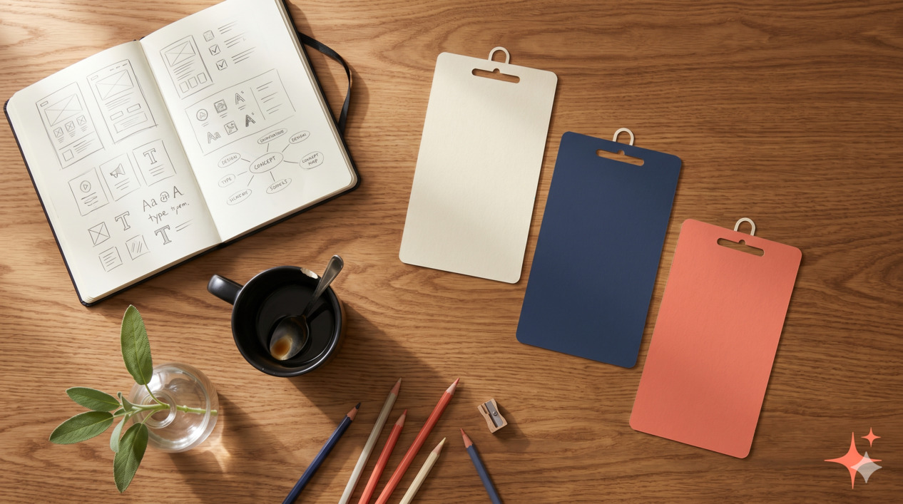
How we tested
Six accounts: home organisation, productivity tools, faceless content, finance for beginners, Pinterest marketing (meta, but it works), and a digital products niche. Each account published 10 articles during the test period. Each article got four pin variants. Total: 240 pins.
For each pin, we tracked three metrics over 30 days: outbound clicks per impression (CTR), save rate per impression, and CTR-to-conversion where we had affiliate or email-signup tracking. For our purposes, "what converted" weights save rate and CTR roughly equally, with a smaller weight on downstream conversion (because attribution is messy).
The four variants for each article systematically tested one design element at a time — title style, color scheme, layout, or hook style — so we could isolate which change was responsible for performance differences. Not every test was clean (Pinterest's algorithm is noisy at small sample sizes), but across 240 variants, real patterns emerged.
A note on what we didn't test: we didn't run paid promotion, didn't manipulate boards beyond standard scheduling, and didn't game any results with engagement-bait. The results reflect what works for an organic faceless creator in 2026.
Element 1 — Specific text overlay (the single biggest factor)
The strongest correlation in the entire test: pins with specific, concrete text overlays outperformed pins with vague, aspirational text by roughly 60-90% on combined CTR + save rate.
Specific text overlay means a title that promises a measurable, concrete outcome. Vague text means a title that promises a feeling or general improvement. The difference looks small but matters enormously.
Examples from our test:
| Vague (lost) | Specific (won) |
|---|---|
| "Productivity tips that work" | "12 productivity tips for ADHD brains" |
| "Save money on groceries" | "Cut your grocery bill by $200/month" |
| "Easy Pinterest growth" | "0 to 10K monthly viewers in 60 days" |
| "Become a morning person" | "The 6:00am routine that actually stuck" |
The specific versions outperformed the vague versions in 38 out of 40 paired tests where this was the only variable. This isn't subtle.
Why it works: Pinterest is a search-and-discovery platform. Specific titles match more searches and signal "this pin will deliver something I can verify." Vague titles match nothing specifically and look like the thousands of other generic pins users have learned to scroll past.
Element 2 — Two-color title contrast
Pins where the title used two contrasting colors (not two random colors — two intentional brand colors used consistently) outperformed monochrome titles by 40-50% on save rate.
The pattern that consistently worked across our six niches: a darker color for most of the title, with one or two key words in a brand accent color (typically coral, mustard, or sage in our case — but the principle is brand-consistent contrast, not specific colors).
Examples that worked: "Cut your grocery bill by $200/month" with the dollar amount in coral. "0 to 10K monthly viewers in 60 days" with the milestone in mustard.
Examples that didn't: All-black titles on white backgrounds, all-white titles on coloured backgrounds (no contrast within the title), or rainbow titles where every word was a different colour (visually chaotic).
The cognitive principle: a single highlighted phrase tells the eye where to land in the half-second a pin gets in feed. Without it, the title is read as a wall and often skipped.
Element 3 — Vertical 2:3 ratio (yes, still)
Pinterest's official pin specs allow 2:3 (1000 × 1500), 1:2.1 (1000 × 2100, "long pin"), and square (1:1). The platform's official guidance is that 2:3 is the recommended ratio.
We tested all three. Results were unambiguous: 2:3 outperformed long pins by 25-35% and squares by 50-60% on combined CTR + save rate.
Long pins (1:2.1) got cut off in feed previews on mobile. Squares got disadvantaged by Pinterest's grid layout, which gives more visual real estate to vertical pins. The 2:3 ratio remains the clear winner, and we'd bet against this changing in 2026.
A nuance: long pins did slightly better than 2:3 on a tiny subset of saves (people who saved before scrolling to see the rest of the pin, presumably to read it later). But the CTR penalty was bigger than the save bump, so net result was worse.
Element 4 — A number or specificity hook in the title
Pins where the title contained a specific number or measurable hook (a count, a price, a duration, a percentage) outperformed pins with abstract titles by 35-55%.
This overlaps with Element 1 (specificity), but it's a tighter constraint. Numbers in titles do something specific: they signal "this pin contains a list" or "this pin promises a quantified outcome," both of which trigger Pinterest's search-and-save behavior.
Patterns that consistently outperformed:
- "12 productivity tips..." (count of items)
- "Cut your grocery bill by $200/month" (specific outcome)
- "0 to 10K monthly viewers in 60 days" (before/after with timeframe)
- "The 5-element pin framework" (count of elements)
- "Lost 8 lb without giving up bread" (specific result)
Patterns that consistently underperformed:
- "Productivity tips for busy people" (no count)
- "Save money on groceries" (no amount)
- "Grow your Pinterest" (no measurable outcome)
- "A pin design framework" (no specificity)
The number doesn't need to be in the first three words, but it needs to be present. Titles that buried numbers behind too many filler words still underperformed.
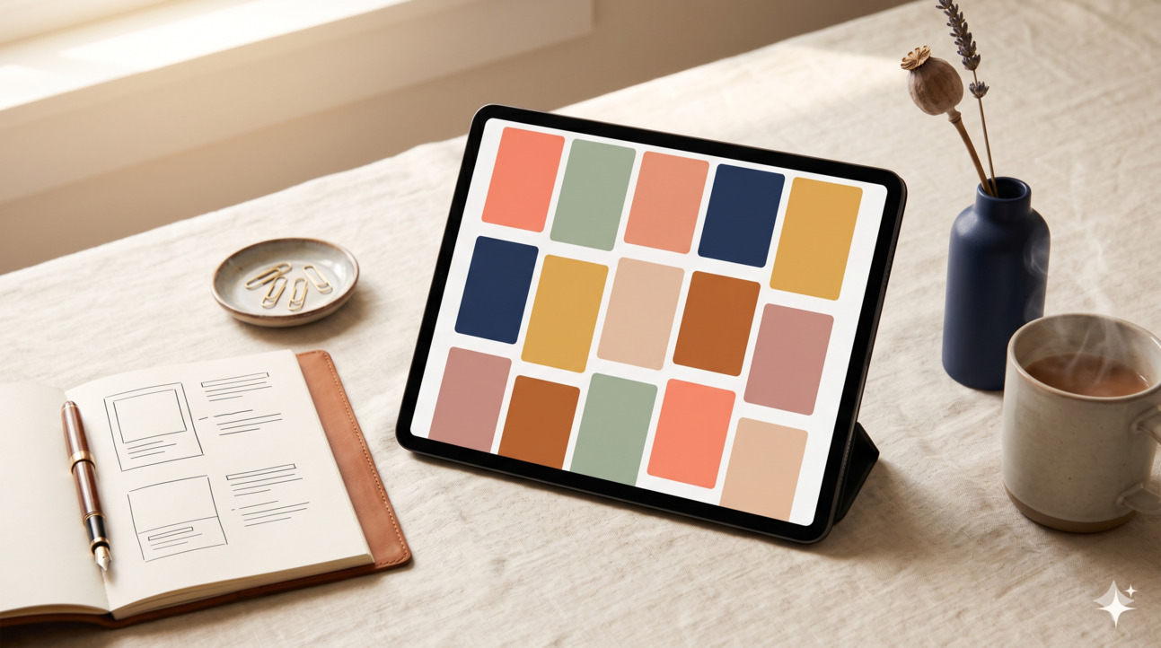
Element 5 — Consistent brand colour blocks across the account
This one is account-level rather than pin-level, but it showed up clearly in the data. Accounts where pins shared a consistent set of 3-4 brand colours (used in different combinations across pins) outperformed accounts where each pin had its own unrelated palette by ~25% on follower growth and impression-to-save rate.
What this looks like in practice: for our home organisation account, every pin uses some combination of cream, sage, navy, and a muted gold accent. Individual pins might lean cream-and-sage, or navy-and-gold, but they're recognisably from the same account at a glance.
What hurt accounts: each pin designed in isolation, picking colours from random Canva templates, no brand cohesion. Even when individual pins were nice, the account's pins didn't reinforce each other's recall.
Why it matters: Pinterest users follow accounts whose pins they recognise in feed. If your pins look unrelated, you're harder to follow consciously. The account stays a one-off save rather than a relationship.
What didn't work (the three myths)
Three patterns that conventional Pinterest advice still pushes — and that we couldn't find evidence for in our 2026 testing.
Myth 1 — Heavy emoji use boosts engagement
This was a real phenomenon in 2017-2019. We tested it: 60 paired pins with and without emojis in the title. Effect on CTR + save rate was within statistical noise (–3% to +5% depending on niche, no clear winner).
Emojis are now so ubiquitous in feed that they don't function as attention-grabbers anymore. They're not actively harmful (we don't see big drops), but the conventional wisdom that they "boost engagement" appears to be outdated.
What we do now: Use emojis sparingly when they add semantic information (a coffee cup emoji on a "morning routine" pin actually communicates something) and skip them when they're just decoration.
Myth 2 — Ornate cursive fonts perform better than clean sans-serifs
We tested 30 paired pins in the home and lifestyle niches where ornate fonts are most popular. Result: clean sans-serif and modern serif fonts outperformed ornate cursive by 15-30% on save rate, almost uniformly.
The likely explanation: ornate fonts are harder to read at thumbnail size in feed. By the time the user has to slow down to decode the title, they've often scrolled past. Clean fonts get parsed in the half-second they're given; cursive fonts often don't.
This doesn't mean ornate fonts can never work — they can be effective for short, evocative titles ("Sunday slow morning"). But for the standard "specific outcome" pin title, clean fonts win by a clear margin.
Myth 3 — Three-image collage layouts boost saves
The three-image collage (header image + two below) was a popular template circa 2020-2021. We tested it against single-image pins and against text-dominant pins.
Result: three-image collage layouts underperformed single-image pins by 20-30% on CTR, with no compensating save-rate boost. The reason seems clear: each image in the collage is small and hard to parse at thumbnail size, so the pin reads as visual noise rather than as a clear promise.
Where three-image layouts can still work: round-up posts where the three images directly correspond to three list items mentioned in the title ("3 productivity apps tested"). For everything else, single dominant image plus text overlay is the cleaner pattern.
The 5-element framework (consolidated)
If you're designing pins from scratch in 2026, here's the consolidated framework that emerged from the data:
- Specific text overlay — Promise a concrete, measurable outcome. Not a feeling.
- Two-color title contrast — Most of the title in your dark brand colour; one phrase in your accent colour.
- Vertical 2:3 ratio — 1000 × 1500 pixels. Don't use squares.
- Number or specificity hook — A count, a price, a duration, a percentage. Specific.
- Consistent brand colour blocks — 3-4 brand colours used across the account, recognisably yours at a glance.
That's it. There are dozens of secondary factors (typography pairings, photo treatments, background patterns), but they're noise compared to these five. Get these right and most of your pin-design problem is solved.
The biggest design upgrade isn't a new template
Now the real punchline. The single biggest gain we observed wasn't from designing better pins — it was from killing the bottom 20% of pin variants within 30 days of publishing.
Most creators publish 4-5 pin variants per article and then leave them all running indefinitely. The data is unambiguous: within 30 days, the worst-performing variants in any 4-pin set are doing roughly 10-15% the engagement of the best variant. Leaving them running drags down the account's algorithmic signal because Pinterest interprets your low-performers as a pattern of low-quality content.
The discipline is simple but rare: every 30 days, look at the data per pin variant. Archive the bottom 20%. Replace them with new variants based on what you learn from the winners. Most accounts compound their growth this way more than they do from any individual design improvement.
Free pin templates
At the end of this section we'll add a downloadable Canva template pack reflecting the 5-element framework. For now, the framework itself (above) is enough to start building your own templates: pick your 3-4 brand colours, set up two title styles (a dark base + an accent highlight), commit to 2:3 ratio, and build templates around specific-outcome titles with numbers.
We'll update this article when the template pack is ready.
What this means for your account
If you're starting a new faceless account, build the templates around this framework from day one. Save yourself the rebuild later.
If you're running an existing account, start with the 30-day variant audit. Most accounts will see clear winners and losers in their existing pins — the data is already there if you go look. After that, gradually swap your weakest-performing pin templates for ones that follow the framework.
Most importantly, don't treat this article as a license to spend hours redesigning every pin. The biggest gains come from consistent application of the framework on new pins going forward, not from trying to retroactively perfect old ones. Pinterest is a long-game platform — the next 100 pins matter much more than the last 100.
Frequently asked questions
FAQFrequently asked
How many pin variants should I make per article?
Do I need a Canva Pro subscription to design pins this way?
Should I use AI image generation for pin backgrounds?
How important is the pin description vs. the pin itself?
What's the worst Pinterest design mistake you see beginners make?
Should I use my own photos or stock photos?
How long until pin design changes start affecting impressions?
What to do next
If you're running a Pinterest account and want the full system view — account setup, monetisation, design, blog routing — see our Pinterest Income System reading path. It pulls together the four articles that make up the complete Pinterest income stack.
If you're earlier in the journey, How to start a faceless Pinterest account is the upstream piece. Get the niche and account structure right first; pin design is a downstream optimisation.
For the monetisation playbook once your design is dialled in, Pinterest affiliate marketing complete guide is what we'd recommend reading next.
Drop your email below to get the Faceless Pinterest Niche List — 40 niches we've tested, ranked by competition level and affiliate friendliness, with one example pin idea per niche.
How this article was made
Written by The Hustle Archive Team. Tested by T.V.. Fact-checked by M.A.. Originally published April 30, 2026, last updated April 30, 2026. Read our editorial policy and the methodology behind our rankings.
Found an error? Tell us— we update articles within a week.
Free download
40 Faceless Pinterest Niches
Categorised, scannable, with monetisation fit and example pin ideas.
Read next
More from the archive
Pinterest Marketing · 16 min
How to Start a Faceless Pinterest Account in 2026 (Step-by-Step)
The exact 30-day setup walkthrough we use for new faceless Pinterest accounts. Niche selection, pin design, scheduling, and the first 100 pins.
Read more
Pinterest Marketing · 18 min
How to Make Money on Pinterest in 2026 (7 Methods With Real Numbers)
Seven ways to make money on Pinterest in 2026 with realistic income ranges, time investment per method, and which ones genuinely work for new accounts versus established creators.
Read more
Pinterest Marketing · 16 min
How to Make Money on Pinterest Without a Blog (5 Methods Tested)
Five ways to make money on Pinterest without running a blog, with realistic income ceilings, the methods that actually work, and the tradeoffs versus the blog-routing approach.
Read more


